


BarMe is an app that people can turn to for personalized and credible bar recommendations. BarMe provides suggestions based on bars that you’ve already reported to like. Similar to dating apps you’re “matched” with bars based on the info you provide the app. BarMe differentiates itself by the source of its repository of bars -- recommendations come directly from local bartenders.
Methods: User Surveys & Interviews; User Personas; Research Synthesis & Affinity Mapping; User Journey Mapping; Competitive Analysis; Usability Testing; Rapid Prototyping; Wireframing; UI
Tools: Sketch, Invision
Outcome: A verified app concept that addresses a user need

If you’re like most people, there are a few bars you frequent and love. It’s not that you don’t want to venture out, it’s just… Where would you go? Would you like it there? Who would you even ask for a recommendation? You could Yelp it and keep your fingers crossed that the only reviews aren’t coming from just disgruntled customers. You could ask a friend. But, most of your friends frequent and love the same few bars you do.

Exploring the problem
Inspired by a recent trip to Toronto, BarMe was actually born a “travel app” concept. As a traveler exploring the city I was pretty dependent on Yelp and Google, but I repeatedly found myself asking the resident bartender where to head next. Every single bartender’s recommendation was spot on throughout the entire trip.


User Research - User Interviews & Surveys
I soon discovered that soliciting bar recommendations from bartenders is pretty common, and it’s not just travelers making the requests. User interviews showed that people were interested in receiving recommendations when traveling and in their home city. City visitors and city-dwellers alike are always on the search for a great recommendation. With that in mind, my research focus shifted towards daily life and away from a travel-specific scenario.
I then conducted user surveys via Google Forms. The primary purpose of the surveys was to determine where people currently turned for bar recommendations and whether they would consider recommendations from local bartenders to be more reliable than traditional user reviews (like Yelp). Both user interviews and surveys revealed that respondents highly value the opinions of local bartenders when deciding which bar to go to.

“This trip was great thanks to all the recommendations we got from local bartenders. I feel like we went to every really cool bar in the city.”
Personas
User research verified that there are two types of users with very different needs and goals. I created two user scenarios featuring the two primary use cases of the app — Piper is looking for a recommendation and Jeff is a bartender making recommendations.


Identifying & Prioritizing
I used affinity mapping to identify research themes and group pain points. I then used an impact axis to determine priority. It was made clear that personalized recommendations from locals were key.

MVP (Minimum Viable Product)

Competitive Analysis
While there is no direct competition, there are multiple apps with similar offerings including Yelp, Zagat, OpenTable and Lonely Planet. While each of these apps can make a sufficient bar recommendation, none take user preferences into account when providing suggestions.


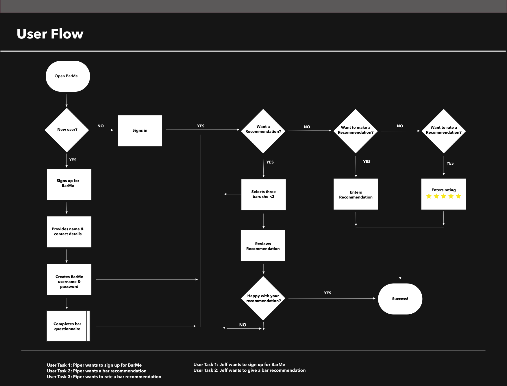
User Journey + User Flow
I based the user journey on Piper’s primary goal when using the app — to get a bar recommendation. I mapped out Piper’s behavioral flow based on both a “typical” and an “atypical” journey to better understand how users would successfully navigate through the app and where pain-points might arise.

Rapid Prototyping
I had a vague idea of how the app would work, but it wasn’t until I started sketching out the various screens that I got a really solid idea of the flow and functionality.

Wireframes
Using Sketch and Invision, I then created low-fidelity wireframes for testing purposes.

Wireframe Usability Testing
Participants were asked to do the following tasks:
1- Login in and get a bar recommendation
2- Sign up as a bartender and give a bar recommendation
3- Rate a recommendation
While users were successfully able to complete each of the tasks, I discovered that the icons included alongside the “Want a recommendation?; Want to give a recommendation?; Want to rate a recommendation?” copy are unnecessary and potentially confusing.

Mood Board

High-Fidelity Mock-Ups: Homepage Evolution
After testing out usability mistakes, I focused on designing the final screens in Sketch. Guided by usability testing, there were four major iterations.

High-Resolution UI: Final Design
The get a recommendation, give a recommendation and rate a recommendation sequences.
